A New Realist Supplement
Sachs and Kaufman envisioned an exhibition, less rigid than the Guggenheim’s, that would
expand its purview beyond painting and encompass a range of artists who engaged “the object”
and mass media. They chose works on paper by some of the “Six Painters,” but also
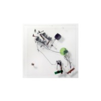
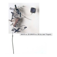
incorporated sculpture, including radio drawings by the European Nouveau Réaliste Tinguely
whose work Sachs had seen at the Janis Gallery. The paintings in the “Supplement” embraced
strands of outrageousness quite different from the more taciturn approach of the New York-
based Six Painters. As the curators worked through their selections over the summer of 1963,
Kaufman wrote of “the animus I bear toward Pop art and the intrigue it, nevertheless, holds for
me at the same time” (Kaufman to Sachs, August 4, 1963).
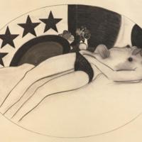
Jim Dine
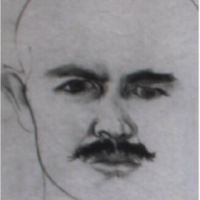
A note from Melanie Holt: Jim Dine has described his work as autobiographical, creating well over one hundred self portraits in the last 30 years. What sets apart each individual image in this collection of portraits is the gaze in which he sketches on the face. It’s easy to see the progression in aging while looking at multiple of these side by side. Self Portrait, 1957, is simple yet allows Dine, as an artist, to look extremely inward to himself. He says about his self portraits, “This is me, running after myself.” (Albertina 2016)
Rosalyn Drexler
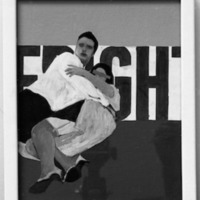
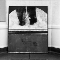
A note from Prof. Zurier: The original version of Drexler's Fright is now unlocated. This photograph was made at the time of the installation in Ann Arbor by the University of Michigan News and Information Service.
Stephen Durkee
A note from Prof. Zurier: Durkee was recommended to the organizers of the New Realist Supplement by his dealer, Allan Stone (Stone 1963). The paintings shown in Ann Arbor took their imagery from aging circus posters and outmoded lettering combined, in Small Canticle, with a diagram of an inscrutable machine. Within a year the artist abandoned this phase of his career for more mind-blowing work with the collective USCO.
Jasper Johns
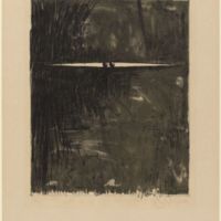
A note from Rachel Feldman: This lithograph is one of several that Johns based on his original painting that included two wooden balls inserted in a gap in the canvas. When asked about the significance of the title of the work, Johns remarked “Yes—“It was a ballsy painting,” that “he was really painting with two balls”(Johns 1996). The Abstract Expressionist movement was often associated with conveying primal emotions and feeling, and many artists within the movement intertwined this notion with their masculinity. Johns, who did not ascribe to this notion, thus created works such as Painting with Two Balls as a jab to those artists who viewed their work as a testament of their masculinity, depicting two balls--quite literally--as the central focus of the work.
Roy Lichtenstein
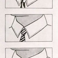
A note from Claire Abdo and Jim Wilson: In her review in the Michigan Daily, Miriam Levin wrote that Lichtenstein focuses on “the use of the ordinary objects or images with which anyone living in our impersonal industrial society comes in daily contact” and that “These objects are singled out by the artists and underlined via multifold enlargement or repetition.” (Levin 1963). To put that simply, Lichtenstein’s art focused on items that most people saw regularly, and then he would manipulate them in some way in order to focus only on them. Most commonly, Lichtenstein would find an image that he liked in a comic or advertisement, then he would enlarge and/or duplicate that image in order to focus solely on the aspect of the image that he wanted to depict. His drawing The Collars uses this technique. Lichtenstein took a depiction of a man’s bust, but he cropped it to focus only on the man's collar and jawline. Then he duplicated the image two more times, but rather than keeping every duplication the same as the original, he changed some small details, such as the pattern of the tie or the detailing on the collar (Dervaux 2011).
Like much of Lichtenstein’s work at this time, The Collars deals with gender. The Collars takes an image of a stereotypical man wearing a shirt and tie during the 1960s and transforms it into a social commentary. He is criticizing the common idea at the time that all men had to be the same: work all day long and then go home to take care of the wife.
Claes Oldenburg
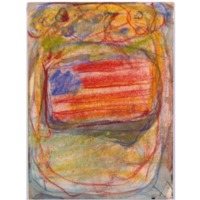
We were unable to locate most of the exact works that appeared in this exhibition. We have used approximations or substitutes for all except Three Figures and One Bus.
A note from Colin Beresford: The drawing American Flag, which was shown in the New Realist supplement, is unlocated. This version, Study Using an American Flag, did not appear in the New Realist Supplement, but could closely resemble it. Oldenburg acquired a fascination with flags during the summer of 1960, when he was in Provincetown on Cape Cod. During this time, many of his pieces were inspired by flags, and much of his journal entries of the time concerned his sentiments towards them as well. He saw the flag as an appropriate subject “for a town so focused on the commercialization of patriotism and history” (Johnson 1971).
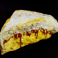
A note from Yiyi Gao: Oldenburg’s works shown at the New Realist Supplement Exhibition were not well documented. This piece may resemble Slice of Pie, which was exhibited at UMMA in 1963. It is roughly painted and has a scrambled surface. Both works were made around 1961, and possibly both were from his 1961-1962 “The Store” series comprised of objects made from crushed materials soaked in plaster and painted in thick, dripping paint. Oldenburg wrote in 1961 that art “ embroils itself with the everyday crap & still comes out on top” and art is “heavy and coarse and blunt and sweet and stupid as life itself” (Oldenburg 1961). The roughly painted sculpture of pie made from plaster and possibly other cheap material found on the street represented “everyday crap”: it was not shining and attractive but looked like “leftovers.” People could relate the sculpture more with their ordinary life: both the “stupid” and “sweet” sides of life.
Robert Rauschenberg
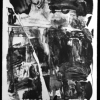
A note from Courtney Ignace and Prof. Zurier: Accident resulted from one of Rauschenberg’s first experiments with printmaking. During the process of creating the lithograph, the lithographic stone broke in two while he was working on it. In keeping with his interest in chance, the artist incorporated the resulting gap and thus pushed printmaking far beyond what it was made to be previously.
Peter Saul
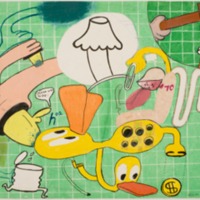
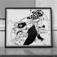
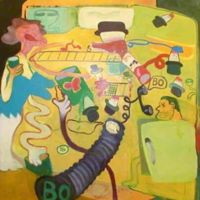
A note from Jack Goldberg: Critic Ellen H. Johnson saw his work as heavy-handed and asked “Have you ever thought of dropping some of the specific allusions in your message, thus making the spectator have to work a little harder to get what you have to say?”, which Saul found ridiculous (McCarthy 2007).
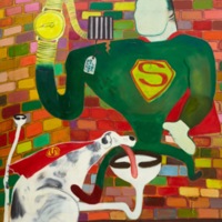
A note from Parth Valecha: Superman and Super Dog in Jail instantly comes off as ironic. During a time when the Cold War and growing tensions in Vietnam were serious issues, Superman and his fellow companion could be found in Peter Saul’s jail cell. As a huge fan of the comics, Saul depicted the popular heroic icon as his prisoner to show that society’s intense focus on pop culture is not an effective way to deal with dilemmas that occur in real life. The gold watch that replaces Superman’s right hand could serve as a sign of passing, or wasting, time. The “hand” on the dial is actually a urinating penis. Superdog’s tail and leg morph into toilets, a reference to how people were urinating and defecating their lives away with trivial forms of entertainment rather than focusing on the issues at hand. Peter Saul creates a dirty, gross scene that pollutes the honorable Superman. He has Superdog lick the toilet bowl that Superman is sitting on. By Superman’s shoulder is a tag reading “Crime Does not Pay,” the title of one of Peter Saul’s favorite comics. Superman is considered as the protector of all Americans in the same way the US government is, yet the tag and the griminess of the cell depict Superman as dishonorable. Peter Saul is trying to shine a light on the dishonor in the US government during a time when people regarded it as the protector of Capitalism and the American people.
Wayne Thiebaud
A note from Kory Barksdale:
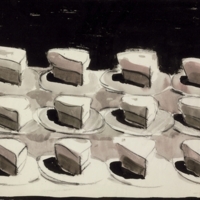
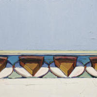
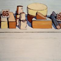
Thiebaud always painted his pieces from memory because it helped create the dreamlike appeal conveyed in his work. The oil paintings shown at UMMA play with bright vibrant colors, using the color of the outline to contrast with both background and the objects described. . . The audience is able to see the strokes of his brush so they get a feel of the artistry that goes into the work. Thiebaud manipulates varying line weights and creating hyper-realistic shadows that help draw the viewer’s eye in and make them believe in what they’re looking at. Looking closer at the picture, Thiebaud also creates sort of an illusion, because he plays around with perspective. You really can’t tell if the pies are all sitting on one surface or multiple surfaces.
A note from Elliott Brooks:
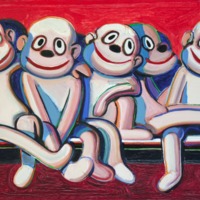
While Thiebaud’s paintings of food items and toys seem to be unconnected with one another, closer analysis reveals a common trend. In a painting like “Sock Monkeys” similar to his paintings of food, Thiebaud plays with color, particularly reds and whites which help to distinguish the objects presented. But unlike Thiebaud’s more typical paintings, “Sock Monkeys” (originally titled “Rubber Dolls”) is a closer depiction of an object that itself is white, while the background serves to provide the color. In addition, his choice of painting sock monkeys gives him the opportunity to play with gaze and perspective . Each monkey is staring at something, whether that be the monkey next to them, or the viewers themselves. Their direction of attention allows the audience to interact with the piece.
Jean Tinguely
A note from Yiyi Gao and Alex Dworman: The curator Samuel Sachs included the Radio Project by Tinguely in the “New Realist Supplement” exhibition at UMMA because he thought the radio combinations were “really interesting” and “they should make a big splash here.” (Sachs to Kaufman July 1963).
Where other artists featured in the exhibition interpreted existing objects, Jean Tinguely disassembled and reconstructed ordinary objects to create an intriguing new reality. These works, part of the artist’s WYNR series, are deconstructed radios that use a motor to rotate the tuning knob and thus move continuously between frequencies, creating a droning sound. The source material for these works was older, discarded radios that used Vacuum tubes instead of the more popular and compact modern transistors. In Ann Arbor, Tinguely’s works were tuned to a local radio station, as opposed to 98.5 FM WNYR, their home station in the state of New York.
To see and hear Tinguely’s Radio Drawing in action, please click here.
Tom Wesselmann
A note from Austyn Marks:
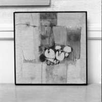
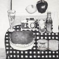
Though he originally sketched the still life at full scale in charcoal, Wesselmann planned for his final work to have commercial images attached to his painting of a checkered tablecloth and a wall, and for a photograph of an orchard to be the view out the window (as evidenced by the white space that fills the window, and two of the objects). In his finished work, Wesselmann used intense paint colors to lessen and nearly eliminate the juxtaposition between the commercial items and the setting. Through this method, the viewer is unsure of what is real and what is not. The related painting "Still Life #12" is now at the Smithsonian American Art Museum and can be viewed here.
H.C. Westermann
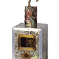
A note from Michael Wrobleski: A veteran of both WWII and the Korean War, Westermann both protested and lamented the violence of modern war . . . There are three distinct components to Westermann’s sculpture “Machine for Calculating Risk”: a re-used trophy with a figure of a man bowling, parts of clock mechanism housed inside a box covered in linoleum with a glass window to expose the gears, and the words “fooey” engraved on the bottom of the box. The symbolism of the ticking clock underneath a seemingly unknowing, carefree man could signify the potential for destruction to mankind. . . Overall, Westermann’s sculpture provides feelings of anxiety in the nuclear age through combining these objects and words.
